View dashboards in IQNECT
The Dashboards is designed to provide a comprehensive, detailed analysis of requirements across multiple projects and view overall KPIs resulting from analyzing requirements in a connected ALM system (Codebeamer). The Dashboard will present findings at various levels of granularity, providing insights into project health based on key performance indicators (KPIs).
Dashboards can be accessed by clicking on the "graph" icon within the IQNECT toolbar.

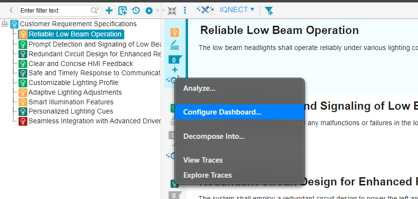
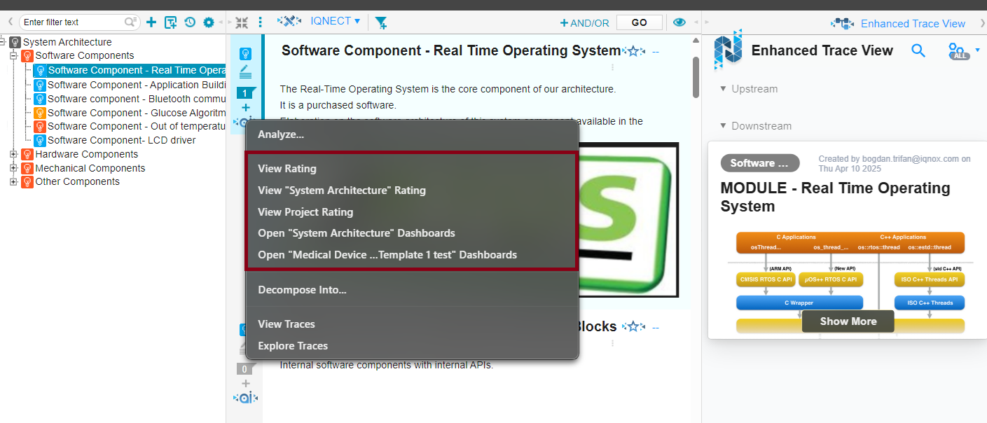
The Dashboard configuration process can also be initiated from any tracker item:
- In document view:
- An IQNECT AI button is located on the tracker toolbar.
- An AI button is located in each item's toolbar.
This system features three primary views: the Project View, the Resource Shape View, and the Resource View, each offering a progressively detailed level of information. They can also be accessed by clicking on any resource that is in an IQNECT view.
Clicking on any item in the highlighted window will display a popup version of the dashboard that can be dragged and resized.
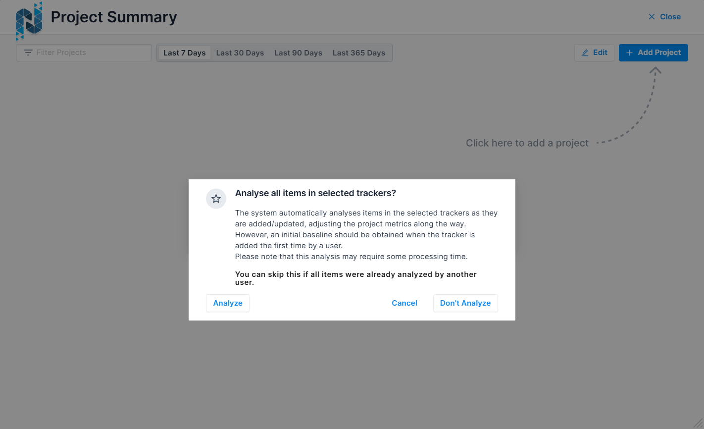
When a user adds a project and tracker to a dashboard, the system will display a popup asking the user if they want to analyze all items from the selected trackers. This will automatically submit all items in that tracker for analysis without waiting for external triggers.
Project View
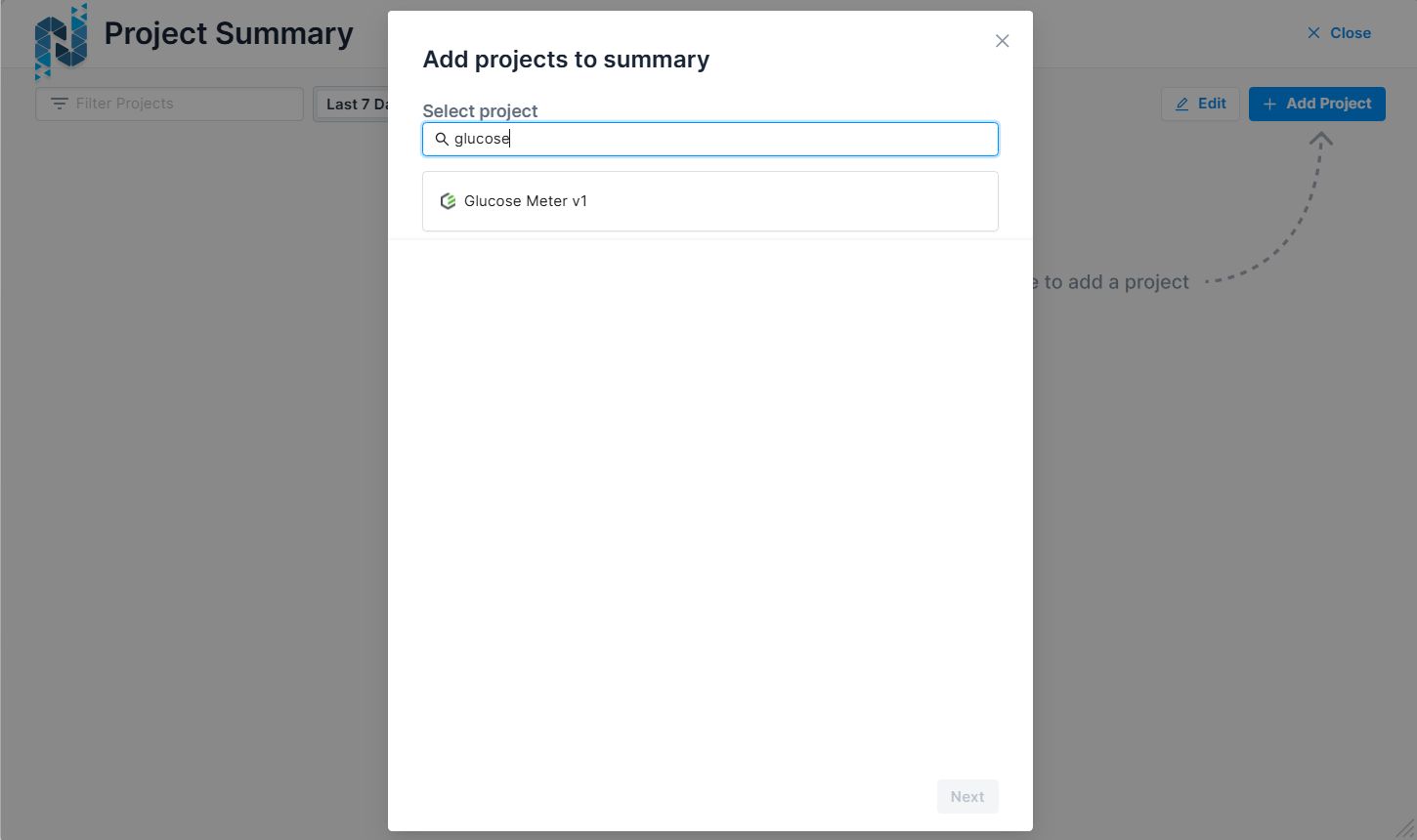
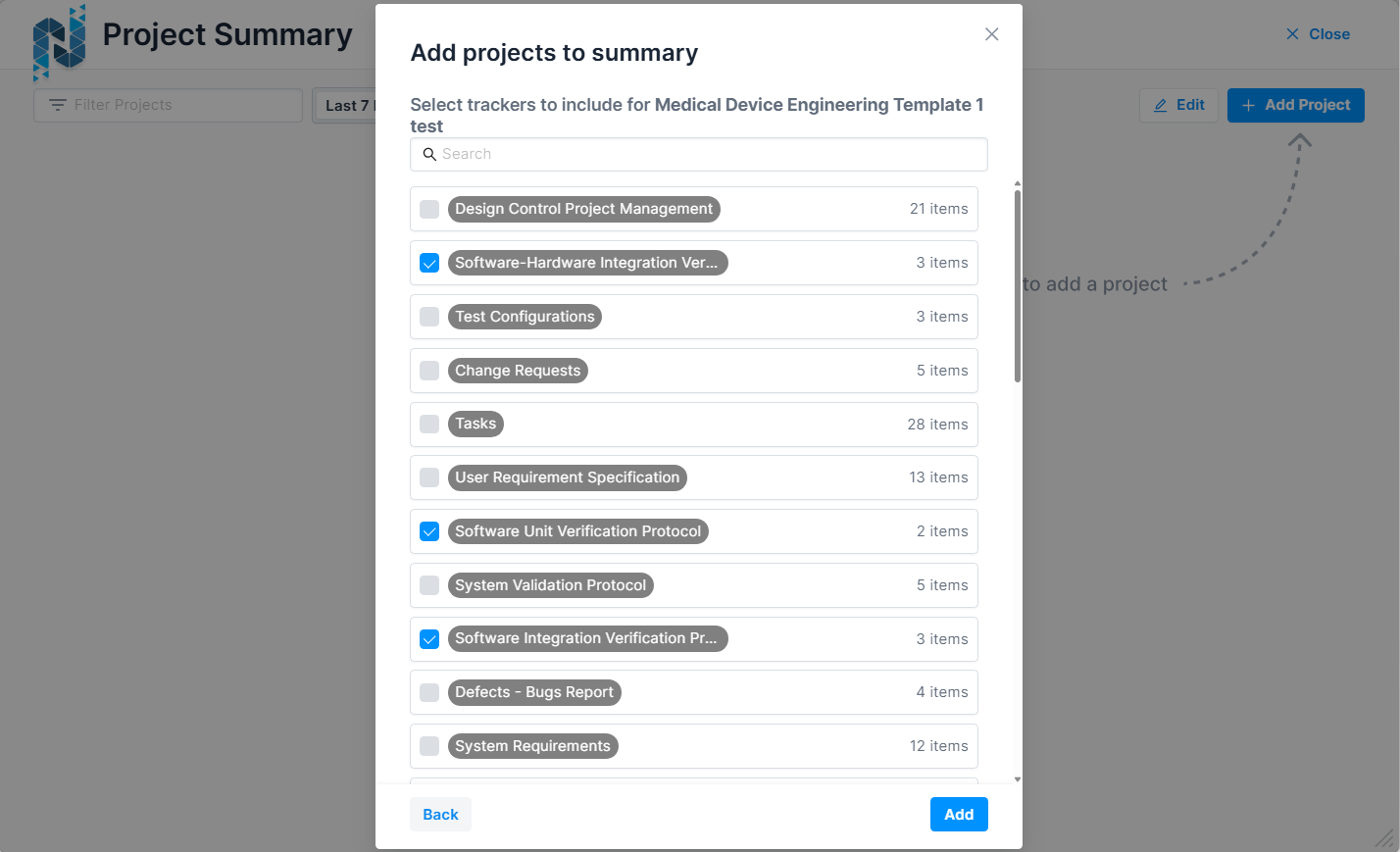
The Project View serves as a personalized project summary dashboard, showing the projects that users are interested in tracking. Users have the ability to add projects to their dashboard from a list of projects they have access to within Codebeamer. This process involves opening a popup where users can select projects not yet added to their dashboard, followed by a subsequent popup to select the resource shapes to be analyzed for each project. This allows different users to track different resource shapes for the same project.
Projects can also be removed from the dashboard through an editing mode that enables an 'X' button on each project card. When all users remove a project from their dashboards, it ceases to be continuously analyzed on the backend. The dashboard offers various time intervals for data display, including the last 7 days, last 30 days, last 90 days, and the last 365 days.
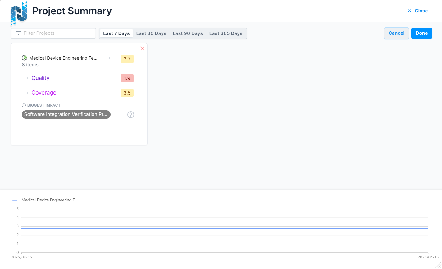
Each project is represented as a card within the dashboard. The card features a header area displaying the system icon (Codebeamer), the project’s title, the total number of resources based on the selected resource shapes, and an icon indicating the trend of the overall score over the selected period. Additional icons may indicate if a project is archived or outdated (gray exclamation mark) or if it could not be synced (red broken link), with tooltips providing further explanation.
The card’s KPI area presents three key performance indicators: Quality, Duplicates, and Coverage. Each KPI is accompanied by an icon indicating its trend, the KPI name, and its respective score.
The footer area identifies the resource shape with the biggest impact on the project's score, determined by the scores of each resource shape weighted by the number of items, and identifies the largest negative outlier. An icon in the footer, when hovered over, reveals which resource shapes have been selected for the project.
The overall score and KPIs are color-coded based on their values, with the exact colors being configurable on the backend. For projects recently added to the dashboard and not yet synced, all KPIs, trend icons, and the biggest impact resource shape will be grayed out, with relevant scores or text replaced by dashes until the first sync is completed.
Above the project list, a filter field allows users to type in project names to filter the visible list, and a time selector control allows users to choose the time interval, with the options described above. Below the projects, a chart displays the evolution of the overall score for all selected projects over the chosen time interval, with each project represented by a distinct line. A legend above the chart indicates which line corresponds to which project.
Resource Shape View
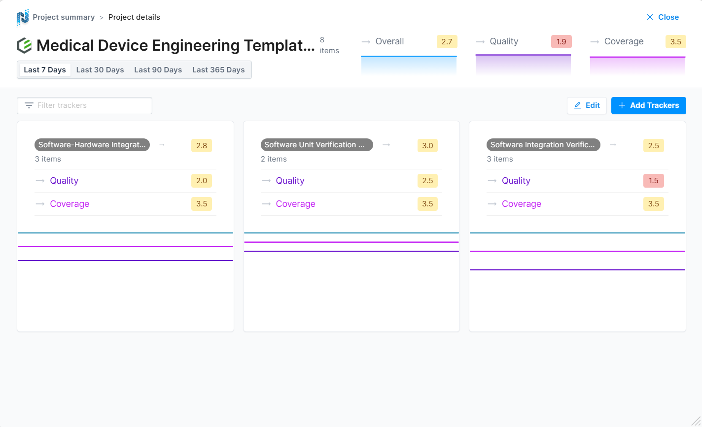
The Resource Shape Dashboards provide users with a comprehensive and detailed view of the resource shapes within a selected project. This feature is accessible by selecting a project from the Project Overview Dashboard.
Upon accessing the Resource Shape Dashboard, users will find a breadcrumb navigation at the top of the screen, enabling them to navigate back to the Projects Dashboard easily. The time selection from the previous view is retained.
The top section of the Resource Shape Dashboard displays the overall state of the selected project in a large horizontal card/header format. This header contains critical information about the project, including the system icon (Codebeamer), the project's name, and the number of resources in it. Additionally, the overall score, quality, duplicates, and coverage are prominently displayed. Each KPI is accompanied by a trend icon, the KPI name, a color-coded score value, and a chart that shows the KPI's historical values over the selected time interval.
Below the project details, a filter field allows users to type in and filter the list of resource shapes by name. The main content area features a grid view, where each resource shape is presented as a card. Each card includes a header area that displays the resource shape name, the count of resources of that shape, a trend icon indicating whether the resource shape’s overall score is trending upwards or downwards, and the overall score.
The KPI area within each resource shape card mirrors the structure found on the Projects Dashboard. It includes KPIs for quality, duplicates, and coverage, each with a trend icon, KPI name, and score indication.
The footer area of each card presents a chart displaying the historical values of the KPIs over the selected time interval. These charts are designed without axis ticks, with the time domain representing the selected interval and the Y-axis domain ranging from 0 to 5. Hovering over the chart reveals the KPI values at specific points in time.
The overall score and all KPIs are color-coded based on their values, with colors being configurable on the backend. For resource shapes that have been recently added to the dashboard and have not yet synced, all KPIs, trend icons, and charts are grayed out, and any relevant scores or texts are replaced by placeholder dashes until the first synchronization occurs.
An edit button on the dashboard enables users to remove resource shapes from the dashboard by displaying 'x' icons next to each shape. Removing a resource shape from this dashboard also removes it from the associated dashboard project. Additionally, an add button allows users to open a popup to select and add new resource shapes to the dashboard, which are also added to the dashboard project upon selection.
Resource View
Resource View
The Resource Dashboards provide detailed insights into individual resources within a project. These dashboards are accessed by selecting a resource shape in the Resource Shapes Dashboard and offer a view of resource-specific metrics and trends. Key features include advanced filtering, sorting, and visualization options, all designed to help users drill down into resource-specific data effectively.
Upon selecting a resource shape, users are presented with a breadcrumb view at the top of the screen, allowing them to navigate back to either the Resource Shapes Dashboard or the Projects Dashboard. The time selection from the previous view is retained.
Below the time selector widget, the overall state of the selected resource shape is displayed as a large horizontal card/header. This section provides information about the resource shape, including its name, the number of resources it contains, and key performance indicators (KPIs) such as overall score, quality, duplicates, and coverage. Each KPI is detailed with a trend icon, KPI name, color-coded score value, and a chart showing historical KPI values over the selected time interval.
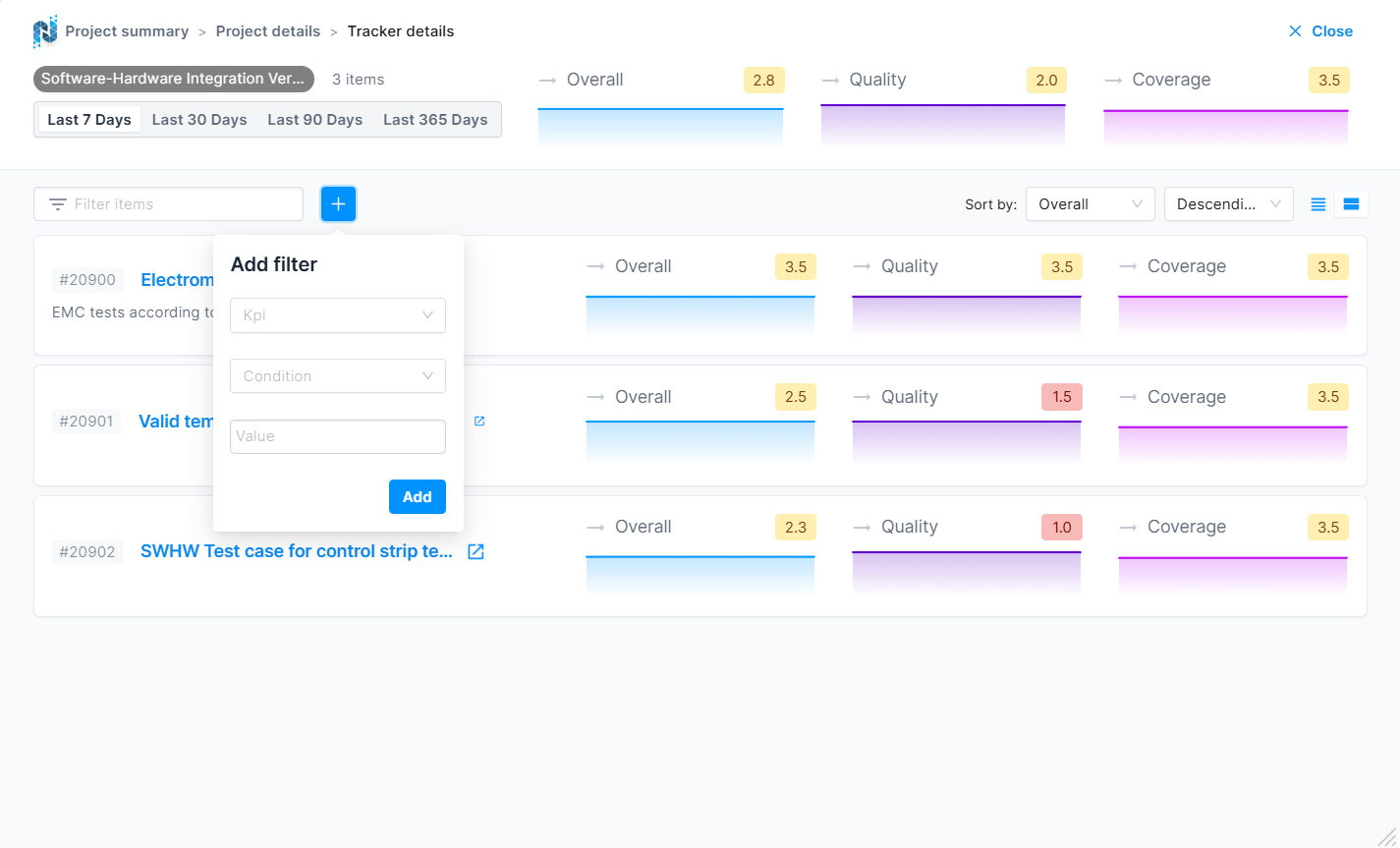
Users can filter the list of resources using a filter field where they can type in the name, summary, or description of a resource. Additionally, a plus button enables the addition of more filters based on specific KPIs. This opens a popup that allows users to select a KPI, define an operator (less than or greater than), and input a value between 0 and 5. All added filters appear next to the name filter field and can be removed with an "x" button.
The filter area also includes two dropdowns for sorting resources by either the name/summary or one of the KPIs in ascending or descending order. A segment control enables users to switch between compact and detailed views. In detailed view, charts are shown under each KPI, whereas in compact view, these charts are hidden.
Below the filters, a list of resources is displayed, with each item showing essential information. On the left side, users can see the resource ID, title/summary, and a trimmed description. On the right side, KPIs are displayed with details including trend icons, KPI names, color-coded score values, and historical charts (in detailed view).
Overall, the Resource Dashboards provide a powerful tool for monitoring and analyzing resource-specific data, enabling stakeholders to make informed decisions and maintain high standards of quality and performance.